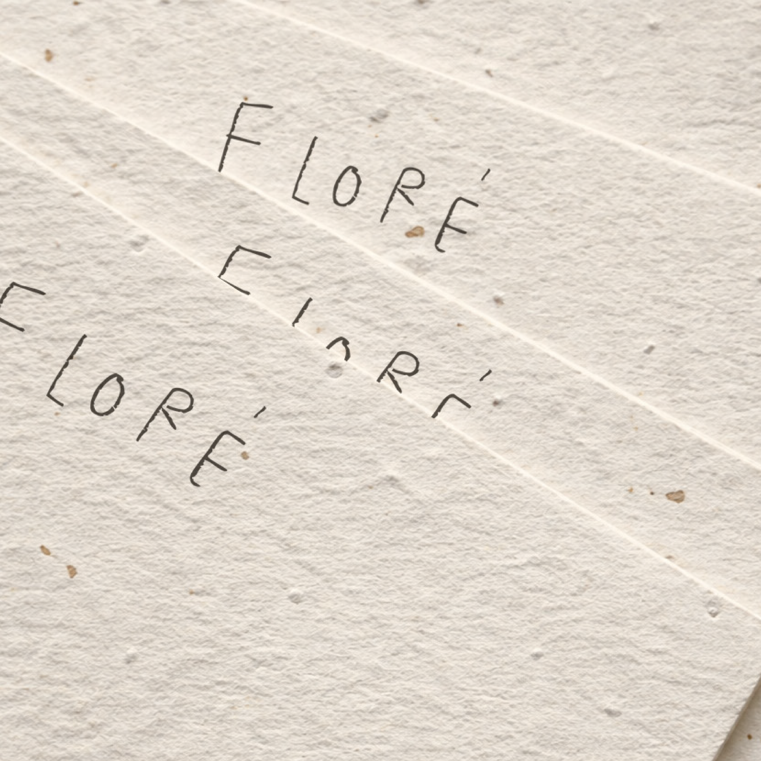
How to Build a Luxury Brand Identity That Feels Timeless and Intentional
Building a luxury brand identity is not about adding gold accents or choosing an elegant font. True luxury lives in clarity, restraint, and intentional design.
A luxury brand feels refined because it is rooted in strategy. It understands who it is speaking to, how it wants to be perceived, and what emotional space it wants to occupy in the market.
As a minimalist luxury branding studio, we approach branding from the inner core. We don’t simply design logos. We build cohesive visual universes that reflect positioning, depth, and meaning.
If you’re building a lifestyle or product-based brand and want to create an identity that feels timeless and elevated, this guide will walk you through the essential steps.
What Defines a Luxury Brand Identity?
Luxury is not decoration. It is positioning.
A true luxury brand identity feels intentional, refined, and emotionally controlled. It communicates clarity rather than excess. The design is restrained. The typography is confident. The color palette is deliberate.
Luxury brands do not shout. They signal.
They understand their audience deeply and create an experience that feels elevated, cohesive, and effortless. That feeling does not come from trends. It comes from strategy.
-
The biggest mistake brands make is starting with the logo.
Before choosing colors or typography, you need to define:
• Who are you speaking to?
• What emotional space do you want to occupy?
• What makes your offer premium?
• Who are your direct competitors?
-
Luxury branding is not about attracting everyone. It is about attracting the right people.
A minimalist luxury brand targeting fashion founders will look very different from one targeting high-end wellness clients.
Ask yourself:
• What level of sophistication does your audience expect?
• Are they trend-driven or timeless?
• Do they value heritage, innovation, exclusivity, or modernity?
Your identity must mirror their aspirations. The best luxury brands feel like a natural extension of their audience’s lifestyle.
-
Typography carries more weight than most people realize.
Luxury brands often rely on strong typographic hierarchy rather than decorative elements. The balance between serif and sans serif fonts can instantly shift a brand from modern minimal to classic refined.
A strong typography system includes:
• A primary display typeface
• A secondary supporting typeface
• Clear hierarchy rules
• Consistent spacing
Luxury is often found in spacing, alignment, and restraint. It is not about complexity. It is about control.
-
Luxury color palettes are rarely loud. They are intentional.
Neutrals, deep tones, soft contrasts, and muted palettes tend to communicate sophistication more effectively than overly saturated combinations.
That does not mean luxury must be beige. It means every color must serve a role
A refined palette includes:
• Primary brand colors
• Secondary supporting tones
• Accent colors used with intention
• Clear rules for application
Consistency builds recognition. Recognition builds authority.
-
A logo alone does not create a luxury brand.
A complete visual identity includes:
• Primary logo
• Secondary logo variations
• A custom symbol or monogram
• Typography system
• Color palette
• Graphic elements
• Photography direction
Luxury brands feel cohesive because every touchpoint aligns.
From packaging to social media to website design, everything should feel part of the same universe.
If your logo looks refined but your Instagram feels inconsistent, the luxury perception breaks.
-
Luxury depends on discipline.
Without brand guidelines, your identity will slowly fragment. Fonts change. Colors shift. Layouts lose coherence.
A strong brand guideline document includes:
• Logo usage rules
• Clear spacing standards
• Color codes and combinations
• Typography hierarchy
• Visual examples
• Tone of voice direction
This ensures your brand remains elevated long-term.
Luxury brands are not built for one launch moment. They are built for longevity.
Common Mistakes Brands Make
• Confusing luxury with ornamentation
• Overdesigning instead of refining
• Copying competitors
• Skipping strategy
• Building a logo without a system
Luxury branding is subtle. It is confident. It is controlled.
And it always begins with clarity.
Final Thoughts
Building a luxury brand identity requires intention at every level. From positioning to typography to visual system development, every decision should support the emotional and strategic direction of the brand.
Minimalism is not emptiness. It is precision.
When strategy meets refined design, luxury becomes natural rather than forced.
If you are building a lifestyle or product-based brand and want to create a cohesive, elevated identity rooted in meaning, the process begins with clarity and direction.
A strong brand identity does not just look beautiful. It feels aligned, timeless, and unmistakably yours.


