The thinking, intuition, and intention behind every brand identity.
There's something fascinating about watching a brand come to life.
An idea becomes a concept. A feeling becomes a color. A story takes shape through typography, composition, and the smallest of details. And eventually, everything comes together to create something that feels exactly right.
As the designer behind Forma Creative Co., this is the part of my work I love most. Finding the connection between creativity and intention, and transforming someone's vision into a visual identity that feels unmistakably theirs.
Here's a little look behind the process.

Every Brand Begins With a Conversation
Before opening Illustrator or exploring typefaces, I start by listening.
Every custom branding project at Forma begins with a Brand Consultation, where we explore the essence of the business, its personality, audience, aspirations, and the feelings we want the brand to evoke.
It's about understanding not only what a business does, but what makes it different.
Sometimes the most valuable inspiration comes from unexpected places: a memory, a material, a particular atmosphere, or a story that has nothing to do with graphic design.
Because before deciding what a brand should look like, I want to understand what it should mean.
Finding the Idea Behind the Identity
This is where everything starts connecting.
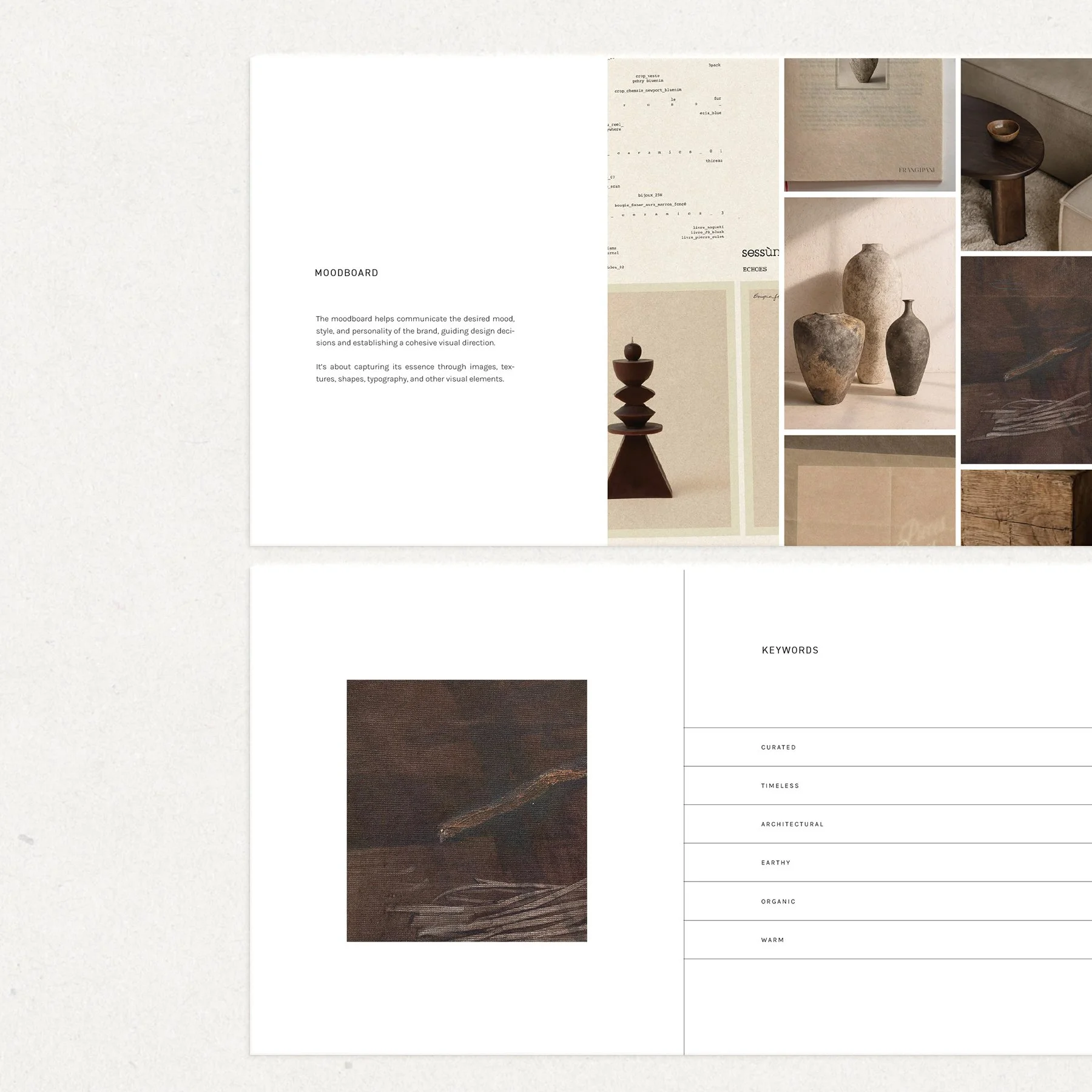
I translate the insights from our consultation into visual references, moodboards, typography, colors, and creative concepts.
But the goal isn't simply to put beautiful things together. It's to find an idea that gives every design decision a purpose.
From there, the exploration begins. Sketching, experimenting with letterforms, refining compositions, and discovering unexpected directions.
Some ideas work immediately. Others need to evolve.
The magic happens somewhere between creative freedom and thoughtful restraint.
The Beauty Is in the Details
I've always believed that the smallest decisions make the biggest difference.
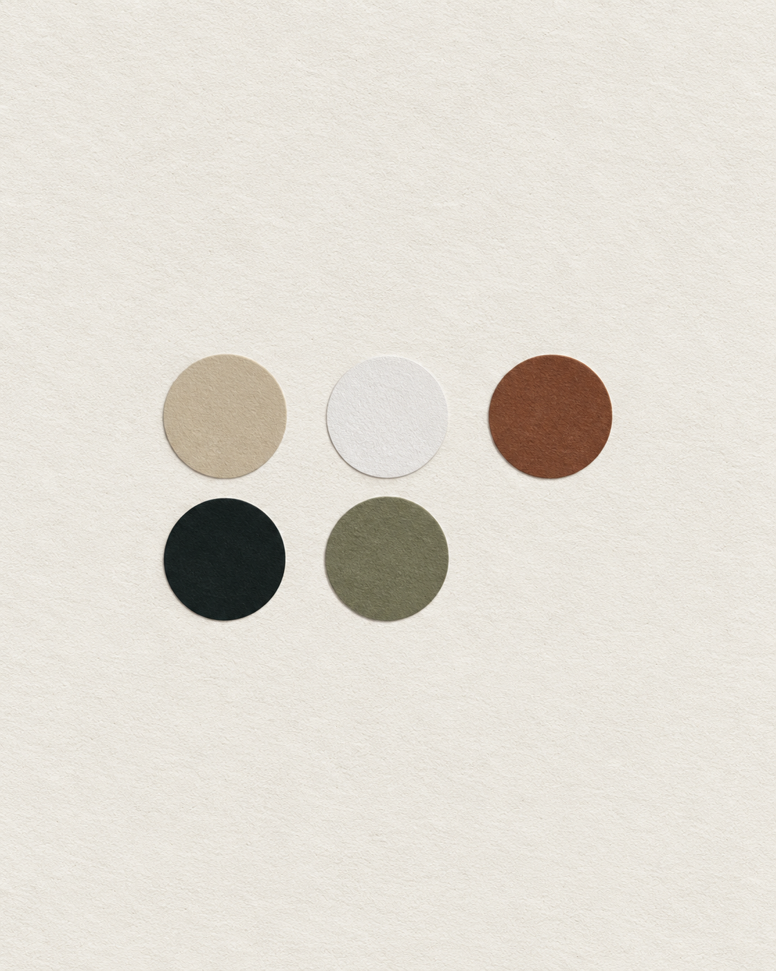
The spacing between two letters. The curve of a symbol. The warmth of a neutral color. The relationship between a logo and its supporting elements.
These details might go unnoticed individually, but together they define the personality of a brand.
I spend a lot of time refining those little things, often making adjustments that are almost invisible but completely change how a design feels.
Because sometimes, good design isn't about adding more.
It's about knowing exactly what to leave out.
Beyond the Logo
A brand is never just one design. It's an entire visual language.
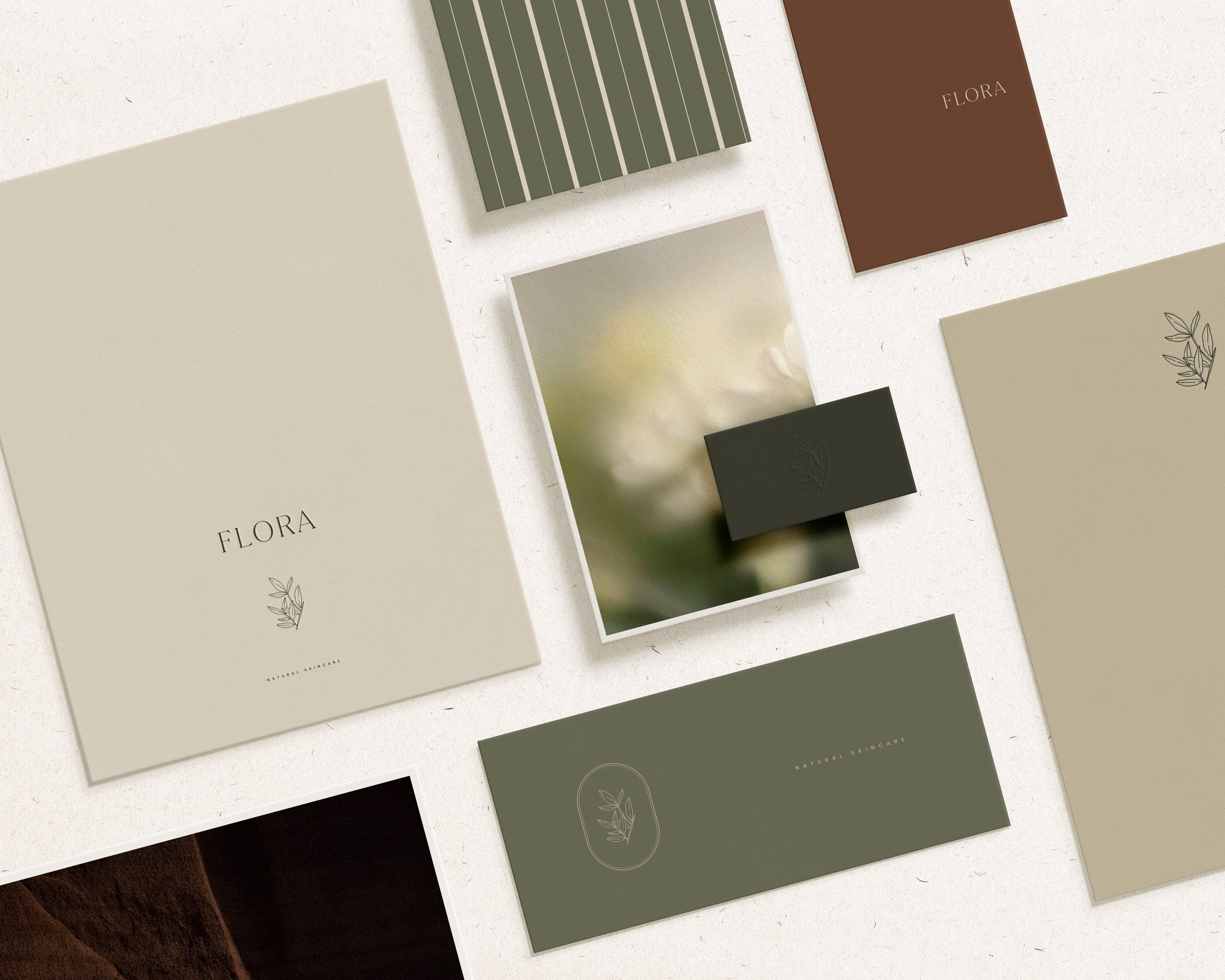
That's why every identity I create is developed as a cohesive system, where typography, colors, logos, patterns, and supporting elements work together.
I love seeing that system come to life through packaging, stationery, websites, and all the places where a brand meets its audience.
It's the moment when individual design elements become something much bigger.
Something recognizable, flexible, and full of personality.
The Forma Philosophy
I don't believe every brand needs to look a certain way.
Some identities are quiet and understated. Others are expressive, playful, or unexpected. What matters is finding the visual language that feels authentic to each business.
The goal has never been to make every brand look like Forma.
It's to make every brand feel unmistakably like itself.
And perhaps that's the best way to describe what I do.
The magic isn't in making something beautiful.
It's in making something feel exactly right.
Let's Create Something Meaningful Together
Every brand has a story worth telling. I'd love to help you find its visual expression.