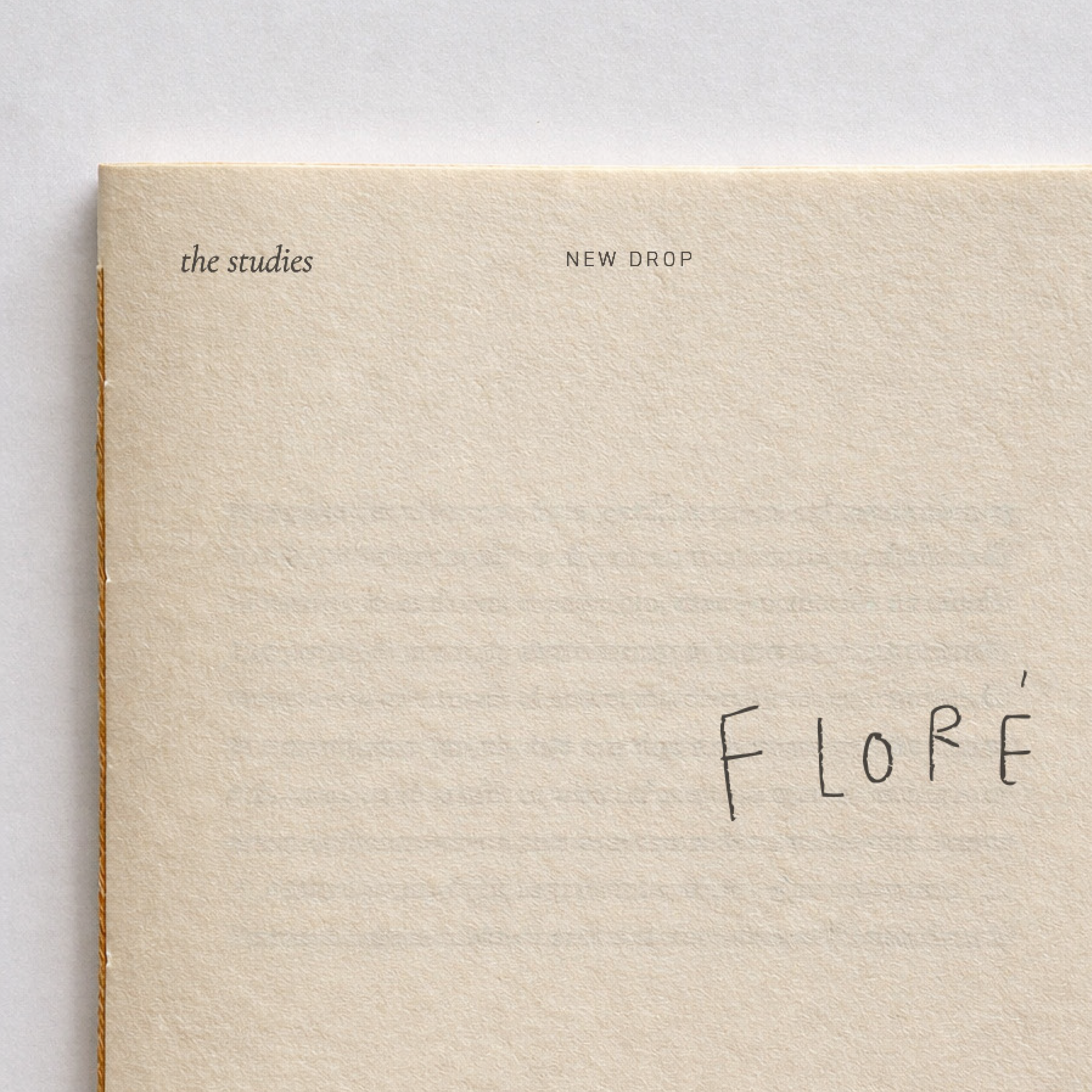
Floré Studio
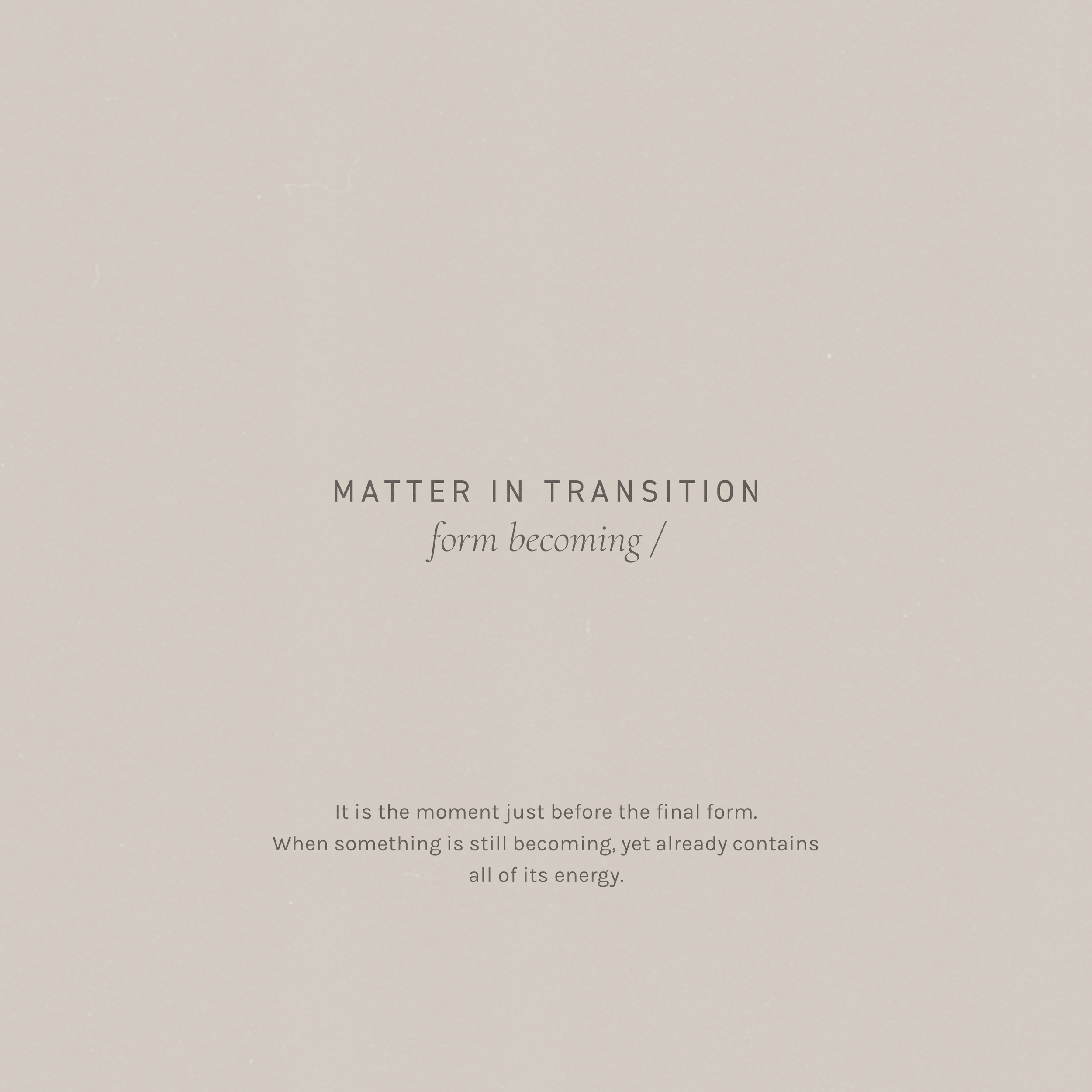
Flore is born at the exact point where matter begins to transform.
It is the moment just before the final form.
The instant when something is still in process, yet already contains all of its energy.
/ BRAND DESIGN
-
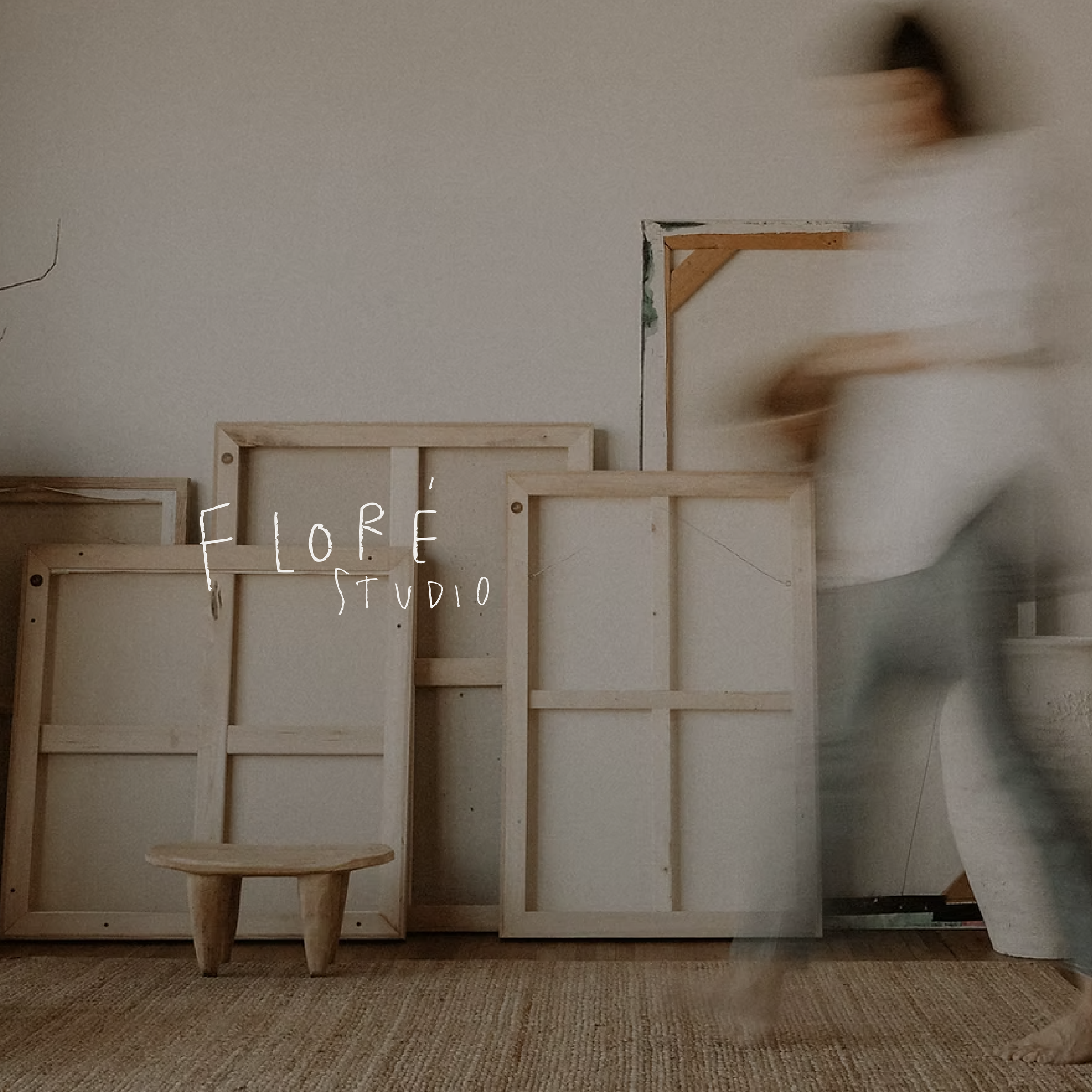
Flore is a curatorial platform where art and object coexist as energy in motion. A space where each piece is selected not only for its aesthetic value, but for the tension it carries, the story it suggests, and the process embedded within it.
-
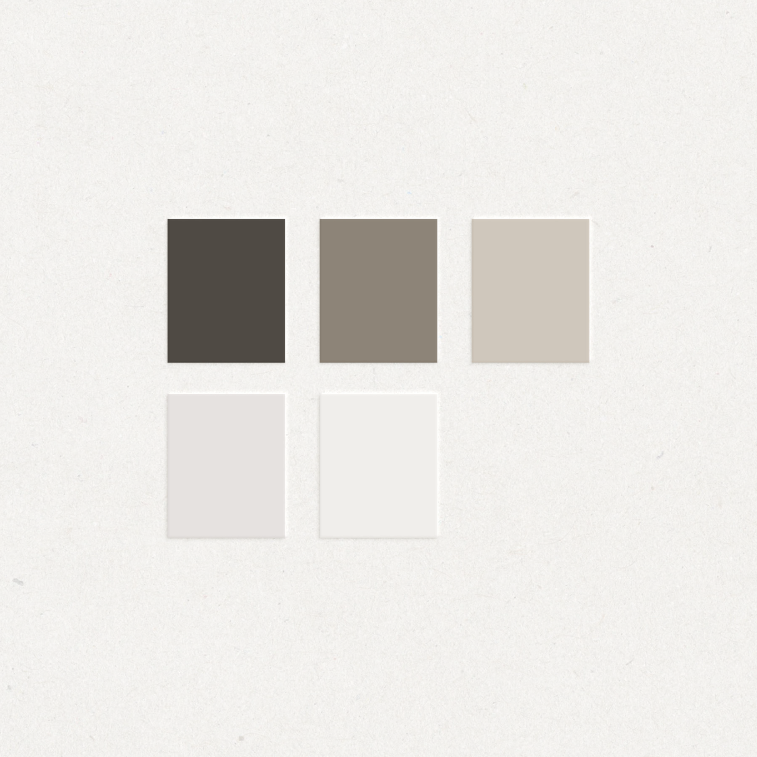
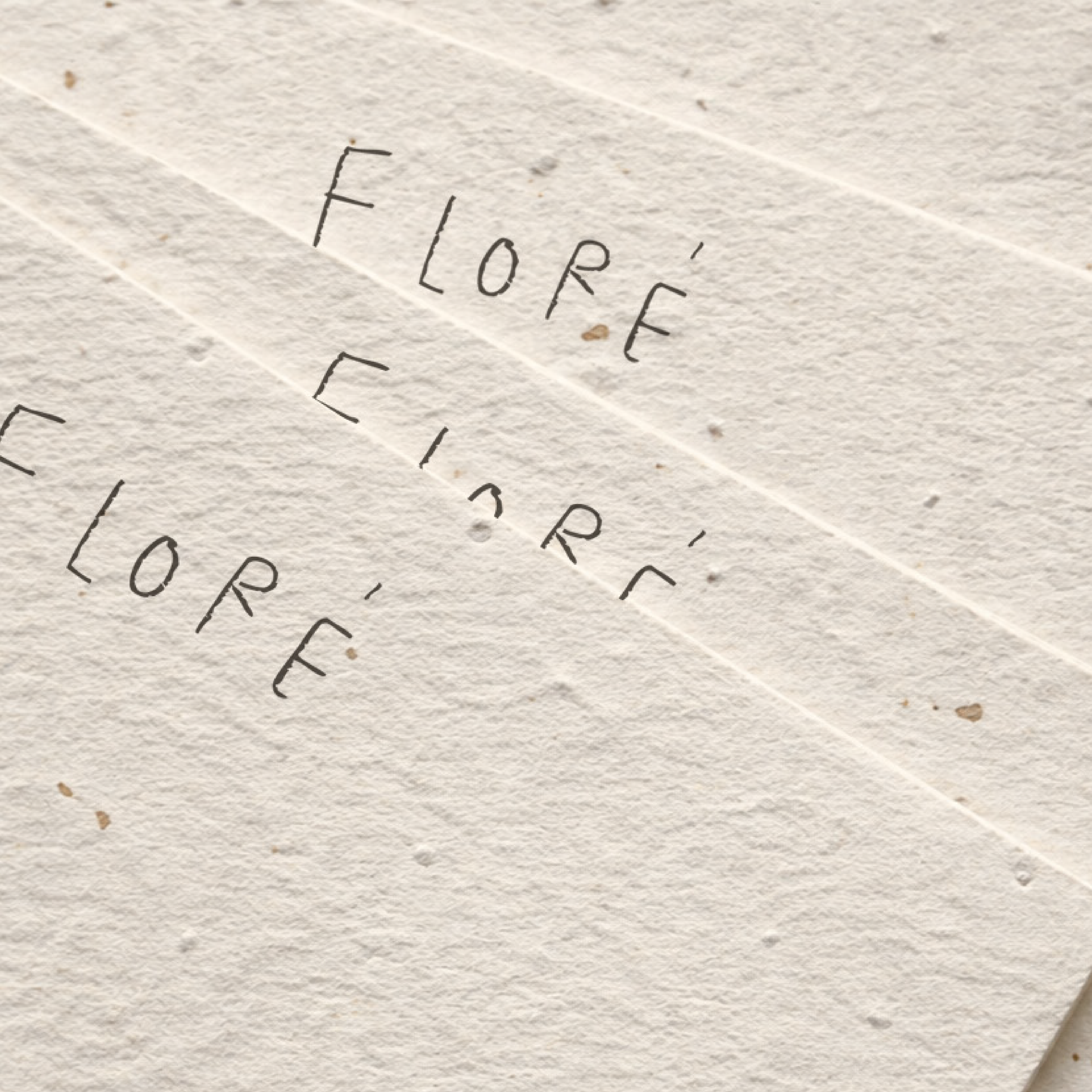
The visual identity for Flore was designed to reflect transition, tension, and contained energy. The challenge was to create a brand system that felt minimal yet conceptually strong, allowing space for art and materiality to remain at the center.
Through restrained typography, intentional spacing, and subtle visual gestures, the identity was crafted as a curatorial framework rather than a decorative layer. The result is a minimalist brand identity that supports artistic expression while maintaining a cohesive and elevated visual presence.
-
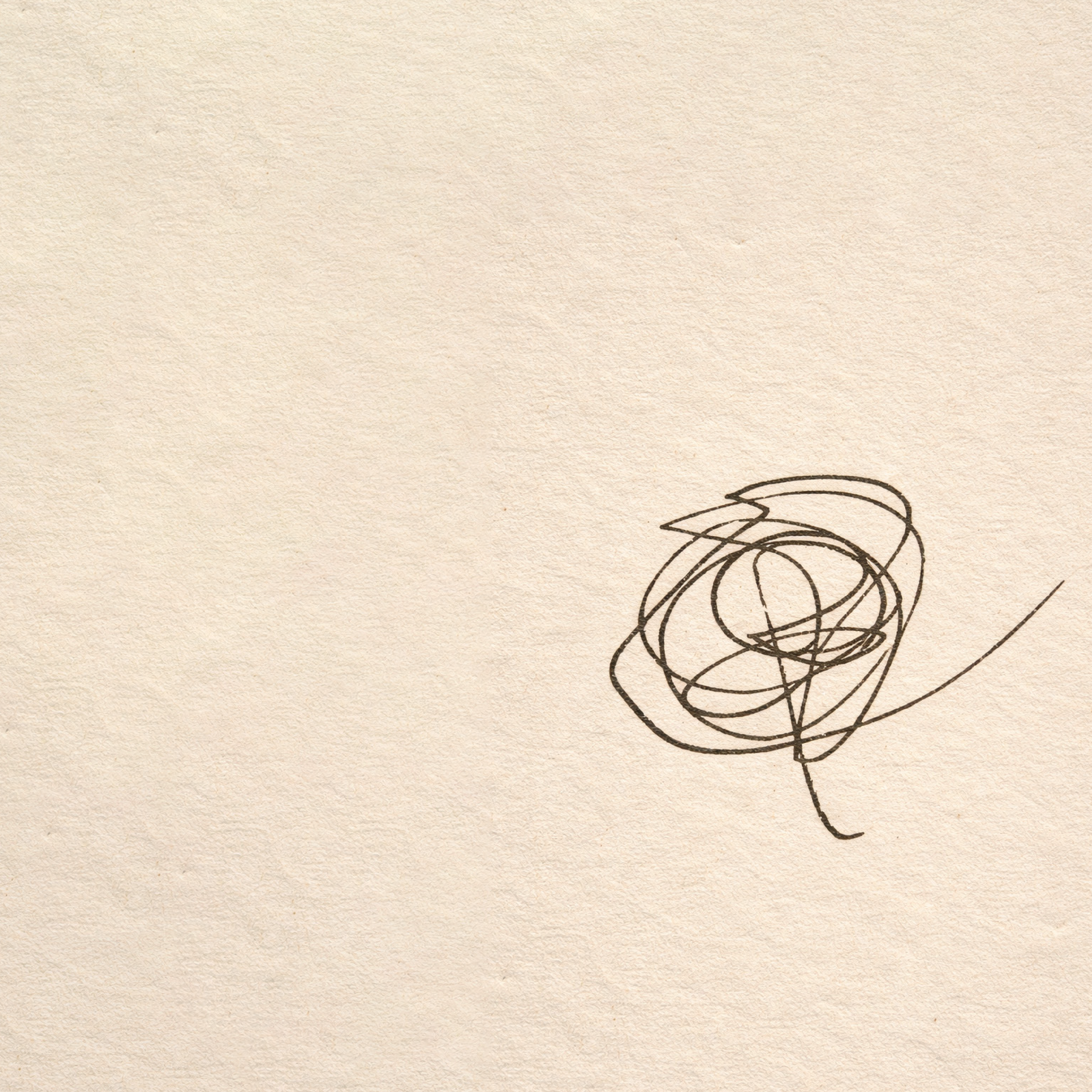
Brand Strategy · Visual Direction · Primary Logo Design · Secondary Logo Variations · Custom Symbol Development · Typography System · Color Palette Development · Brand Guidelines